As part of the Alliance Marketing team, I showed our wide range of marketing agency capabilities through digital icons, one-pagers, and a drip email campaign.
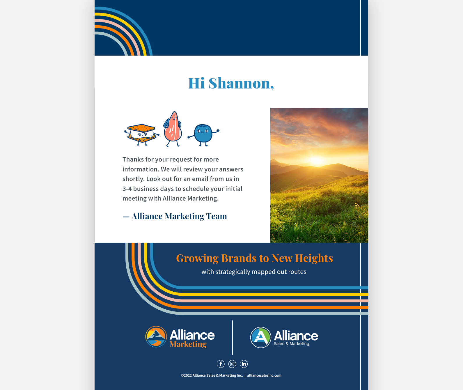
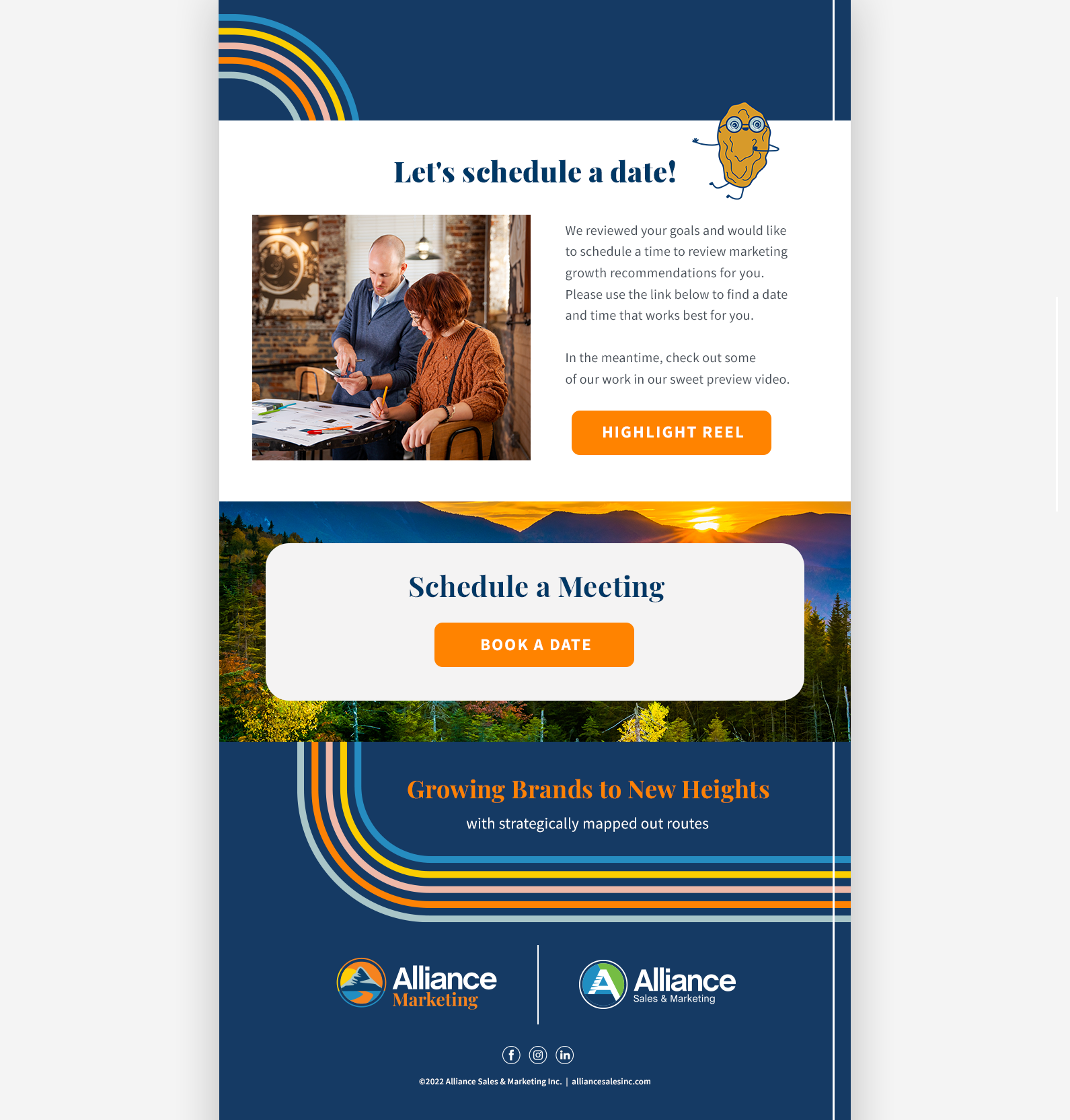


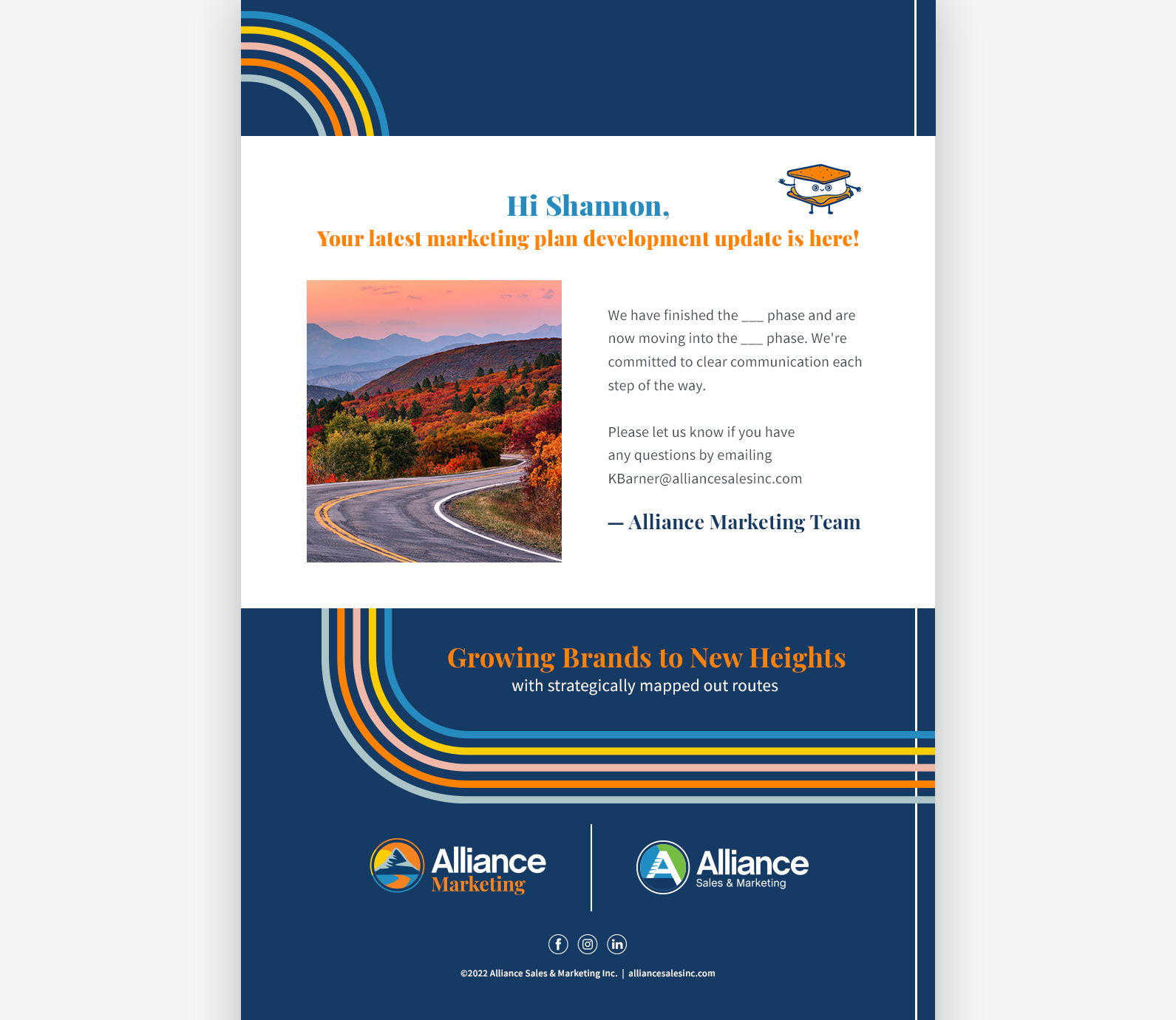
The purpose of this campaign was to keep in contact with Alliance Marketing clients as they went through the process of requesting a meeting with the team, learning more about the services they would receive as clients, and then officially becoming clients. What set the marketing team apart from the broader Alliance Sales & Marketing company was the road-tripping, dream-chasing branding that is rooted in the idea of growing brands to new heights. A rainbow road runs through the entire email campaign in addition to fun camping trip snack buddies that I illustrated to accompany the user as almost all Alliance Marketing clients were consumer packaged goods.
It was most important for me to keep the layout and flow of information seamless in these emails. I also wanted to get the balance of branding, copy, and important callouts just right.

Alliance Marketing offered a wealth of services for brands, including sponsored search, packaging, photo, social media marketing, shopper marketing, and more, and we wanted to communicate that to brands on our website and in client presentations. We also wanted to communicate the results we have driven for brands through one or a combination of services.
To organize this information, I've created over 40 icons for terms like engagement, online shoppers, return on investment, and store visits. The circle container is the same as the one in the Alliance Marketing logo so it ties the icons consistently to the brand. The order of the color of the icons in a list follows the same order in the Alliance Marketing "rainbow road," another important element of the Alliance Marketing brand.
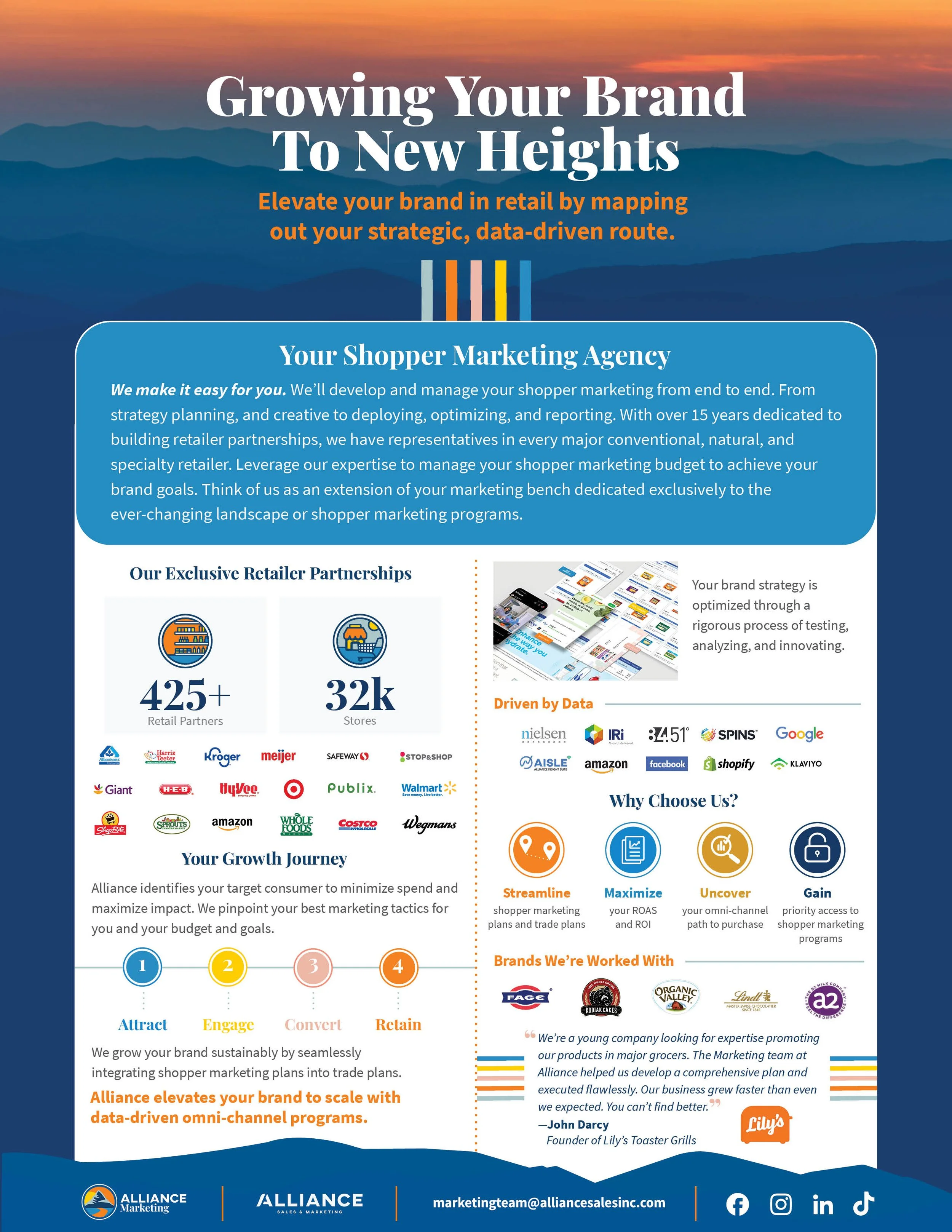
The challenge of designing marketing sales collateral was fitting in a rundown of the agency, all of the retailers we had partnerships with, our marketing process, client testimonials, data capabilities, social links, and more without losing the client in the sauce of information. Designing this one-pager in InDesign was monumental in keeping track of the hierarchy of information. It was also helpful to bring in all of the elements of our agency’s branding, such as icons, rainbows, and lines, to differentiate section from section.

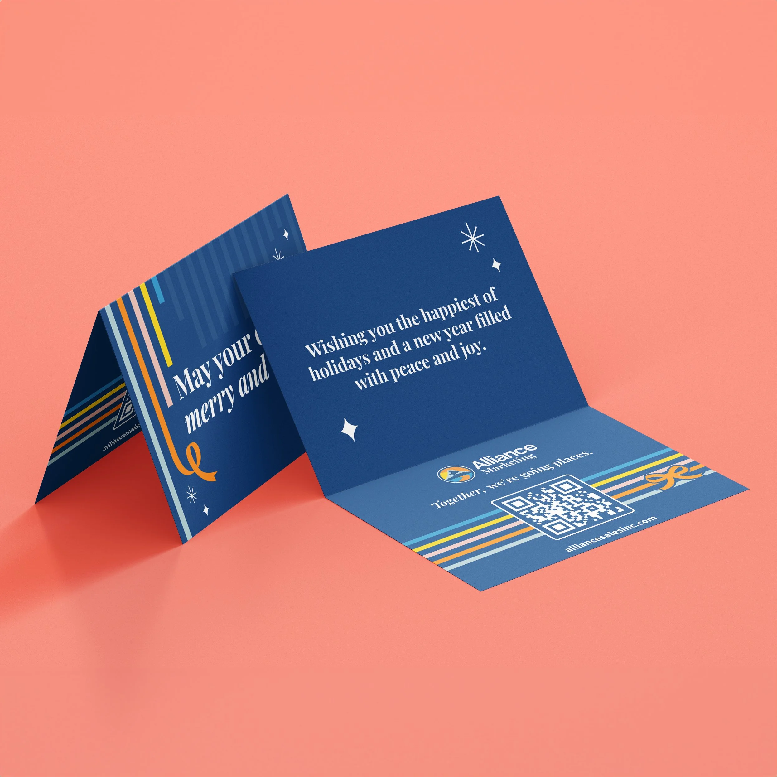
Designing the Alliance Marketing holiday card has been one of my favorite projects to date. I knew the Alliance Marketing’s colors didn’t scream “holiday season” but I still wanted to keep within the branding without pulling in additional holiday elements. The rainbow was a huge part of the brand, so it was a no-brainer to turn them into holiday ribbons and add sparkles that had previously been used in marketing collateral. This was incredible to create such a timeless deliverable for a brand that was only a year old.