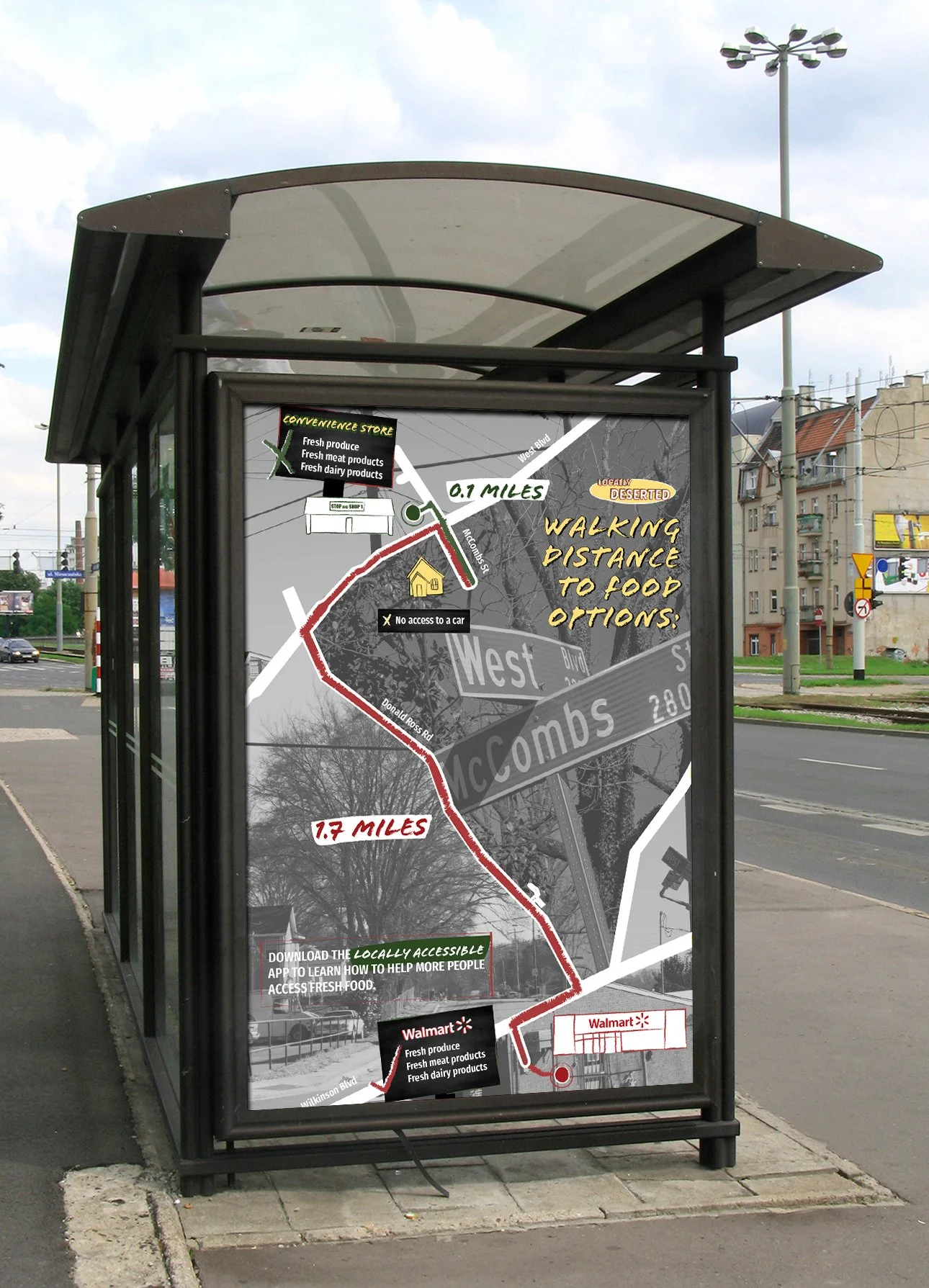
For my thesis project, I created an info card, poster, and resource app to spread awareness and help the issue of food deserts in Charlotte, North Carolina.
An article in Medical News Today defines food deserts as regions where people have limited access to healthful and affordable food. These are often neighborhoods where people don’t live in close proximity to a full service grocery store, often leaving convenience stores and restaurants as their only options for fresh food. The name “Locally Deserted” infers that such a large part of Charlotte is left without important resources and communicates to the audience that this problem exists right in their city. To appropriately portray this desperate issue, I chose to play on the design of grocery store produce signs, which is traditionally outgoing and positive, to have an ironic take on the issue. The color palette goes along with this aesthetic to catch the audience’s attention but in a way that alerts them to the issue.
The informational card was designed to alert individuals to the issue that exists in our city as well as detail specific and direct ways they can help with the intention to place them in grocery stores. Black and white imagery of the three target food deserts, West Boulevard, Brookshire Boulevard, and Albemarle Road, serves as the backdrop to the sketchy, colored design and makes the problem recognizable.
This infographic poster shows real data of the distances a food desert resident has to travel for different food options. I felt that it was necessary to visually break down a key facet of the issue for the audience. Using the same bold grocery store produce sign aesthetic and photography from West Boulevard, bold type and paintbrush illustrations show that a person without a car would have to walk a significantly longer distance to their nearest grocery store compared to their nearest convenience store.
The Locally Accessible app is a resource that connects people living in food deserts to individuals willing to help. The interface is personable and welcoming as it provides a tangible solution to the obstacles of distance and transportation. To start, the user chooses an option, in this case to find fresh food. Once they join, they set up a profile where they can toggle what options for fresh food they want. Hitting the app’s logo pulls up a map that shows what options are available around them. The option to order online is available to simplify accessing fresh food. By choosing an option for a ride to the market or a food delivery, the app locates a volunteer and sends a request to them for the user.


